The Ultimate Guide To Responsive Design: Everything You Need To Know

Struggling to make your website look good on every device? Responsive design is the key to making sites work across phones, tablets, and desktops. Our ultimate guide will show you how to create a seamless online experience for all users.
Dive in and transform your site!
Key Takeaways
- Responsive design makes your website work well on all devices, like phones, tablets, and computers. This means the site changes its layout to fit any screen size.
- Good responsive websites can help you show up higher in Google searches because they load fast and are easy to use on mobiles.
- Using media queries, flexible grids, and making sure images resize correctly are key parts of making a design responsive.
- When your site is easy to use, people stay longer and might look at more pages, which is good for business.
- Webness Studios can help make your website responsive, so it looks great and works smoothly for everyone who visits it.
Understanding Responsive Design

Responsive design is a crucial aspect of modern web design. It ensures that websites adapt to different devices and screen sizes, providing an optimal user experience. At Webness Studios, we understand the importance of responsive design and can help you implement it effectively for your website.
https://www.youtube.com/watch?v=zF6VSky4SIc
Definition
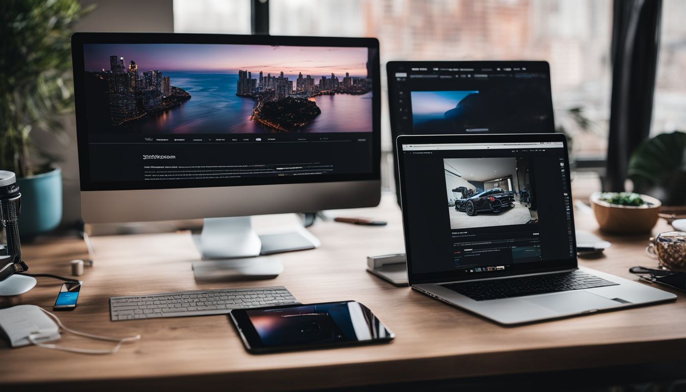
Responsive design ensures web pages display nicely on all devices, such as mobiles, tablets, and desktops. It employs code that adapts the website's layout to suit varying screen sizes and ways of holding the device.
This means that text, pictures, and videos automatically change size and position according to the screen they're shown on.
With this approach, there's no need for distinct versions of a site. One singular web page makes use of HTML and CSS styles – including tools like media queries – to operate seamlessly on different screens.
Whether someone is using their mobile device or a computer, the content rearranges itself to provide a top-notch viewing experience without them having to do anything extra.
Importance and benefits

Responsive design ensures that a website functions smoothly on mobiles, laptops, and desktop computers. It's essential because more individuals now browse the web using their phones.
When your website adapts to any screen size, it's easy for everyone to navigate. This means that regardless of whether someone is using a phone or laptop, they get the best view of your site.
The advantages of responsive design are an improved experience for visitors and a greater likelihood they'll stay on your site for longer. Google favours sites that perform well on mobile devices too.
If your website works nicely on phones and tablets, it could appear higher in search rankings. Plus, with good responsive design, there's less work involved—one site fits all devices, saving you time and money.
Key elements

Responsive design ought to be adaptable. It requires grids that shift and resize effectively to display nicely on any device, whether it's a large computer screen or a tiny mobile display.
Media queries play a crucial role as well. Think of them as little helpers in the code that instruct the website on how it should appear on various devices.
Pictures and icons need to be adjusted properly too. They must get smaller or larger to fit their space while keeping their sharpness and not looking odd. Good responsive design also ensures easy navigation; tapping areas with your finger should be straightforward, with sizeable buttons, and reading text must remain clear regardless of the device being used.
Implementing Responsive Design

Learn the best practices for implementing responsive design and how it can impact your website's SEO. Partner with Webness Studios to ensure your website is mobile-friendly and user-friendly across all devices.
https://www.youtube.com/watch?v=_2wqNI_Ch6g
Best practices
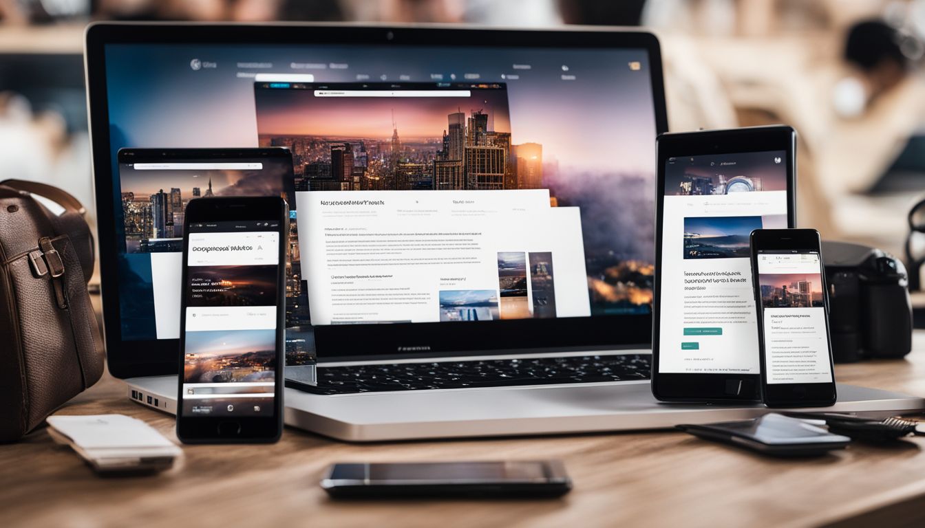
Responsive web design needs to be done right. Start by creating for mobiles first, as lots of people use their phones to look at websites. Use stretchy grids so your layout can change easily on different devices.
Media queries help you set styles for various screen sizes and are good for making sure everything looks neat, no matter the device.
Make sure pictures get bigger or smaller the right way; they mustn’t make loading times slow down. Text size and spacing are important too; it has to be easy to read on any device.
Test everything in multiple web browsers like Chrome, Firefox, and Safari so you can spot issues quickly.
Keep menus simple; remember, not everyone will use a mouse, so your site needs to work with touchscreens and keyboards as well. Finally, make your code tidy by taking out all extra spaces and lines; this helps websites load quicker for everyone.
Impact on SEO

Responsive design is very important for SEO, which means how easily your website can be found on search engines like Google. Search engines prefer to point people towards websites that operate well on any gadget, whether it's a mobile phone, tablet, or computer.
If your website looks good and is simple to navigate on all these devices, it might appear higher in search results.
Good responsive designs also make sure that websites load quickly and keep visitors engaged for longer because everything functions properly. When websites are fast and enjoyable to use, visitors tend to stick around and may explore more pages.
This shows search engines that your website is valuable, which could help you climb higher in the rankings.
Partnering with Webness Studios

Your website will shine on any gadget. Our team has the skills to use stylesheets, media queries, and adaptable layouts for building responsive web designs. Whether someone views your site on a mobile device or desktop, it will function smoothly and be user-friendly.
Opting for our services means you attract more guests who linger on your site. We handle the technical bits like meta tags and breakpoints, so there's no fuss for you. Your website will automatically adjust pictures and text for all screen sizes, ensuring everything looks spot-on for every visitor.
Case Studies and Client Testimonials

Our work shines through our happy clients. They share stories about how their websites now look great on any device, thanks to responsive design. These case studies show real examples of the improvements we've made.
The testimonials often mention better access for users and easier navigation. This means people find what they need faster, no matter if they're on a phone or laptop.
Visitors love the sites because images and text change size smoothly to fit screens. We have many success stories from businesses seeing more sales after updating their website with us.
Next, let's see how wrapping up these ideas can help you make your decision.
https://www.youtube.com/watch?v=Yz3pOF7D-bw
Conclusion

In conclusion, the guide has covered essential aspects of responsive design. You now understand its definition, importance, and key elements. Implementing these strategies is practical and efficient for improving website usability across devices.
Emphasizing the significance of responsive design can lead to substantial improvements in the user experience and SEO performance. Further resources are available for those seeking additional guidance on this topic beyond our discussion here.
Let's embrace responsive design to create better user experiences across all devices!
FAQs
1. What is responsive design in web design and development?
Responsive design means making a website look good on all devices, such as smartphones, tablets, and laptops, by changing its layout to fit different screen resolutions.
2. Why is it important for my website to be responsive?
It's important because your site needs to work well on phones, iPads, or even big computer screens. This helps more people use your site easily, no matter what device they have.
3. How does a media query help in responsive design?
A media query lets you set rules in your cascading style sheets (CSS) so the website can check the browser width and change how it looks based on that size—like showing fewer columns on a phone than on a laptop.
4. Can I use Flexbox for creating responsive layouts?
Yes! Flexbox is a feature in CSS that helps you control how items are lined up and spaced out across different screen sizes, which makes designing flexible pages easier.
5. Will using too many graphics make my webpage less mobile-friendly?
Too many large images can slow down your page for mobile users with small data plans or slower connections. You should always think about file size when adding graphics for better usability.
6. Do I need special HTML tags to make my webpage adjust to portrait and landscape orientations?
No special HTML tags are needed; you just need to write good code using things like viewport properties and ensure stylesheets adapt whether someone uses their phone in portrait or landscape mode.
